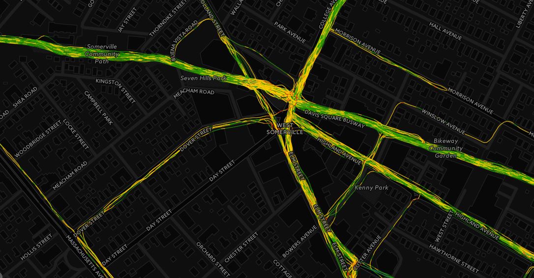
Recently, two State of Massachusetts transportation boards recently voted to approve the long awaited Green Line extension (maybe, hopefully, we’ll see, also the Feds are OK with the new plan). This is huge news, especially if you are an avid transit user, like I am. In the nearly six years I have worked in Back Bay and lived in Winter Hill I have never driven to work, relying on the bus network, and orange and red lines. The Green Line extension, for all it’s faults, is going to improve transit options for one of the most densely populated areas in not only the Boston region, but the entire country.
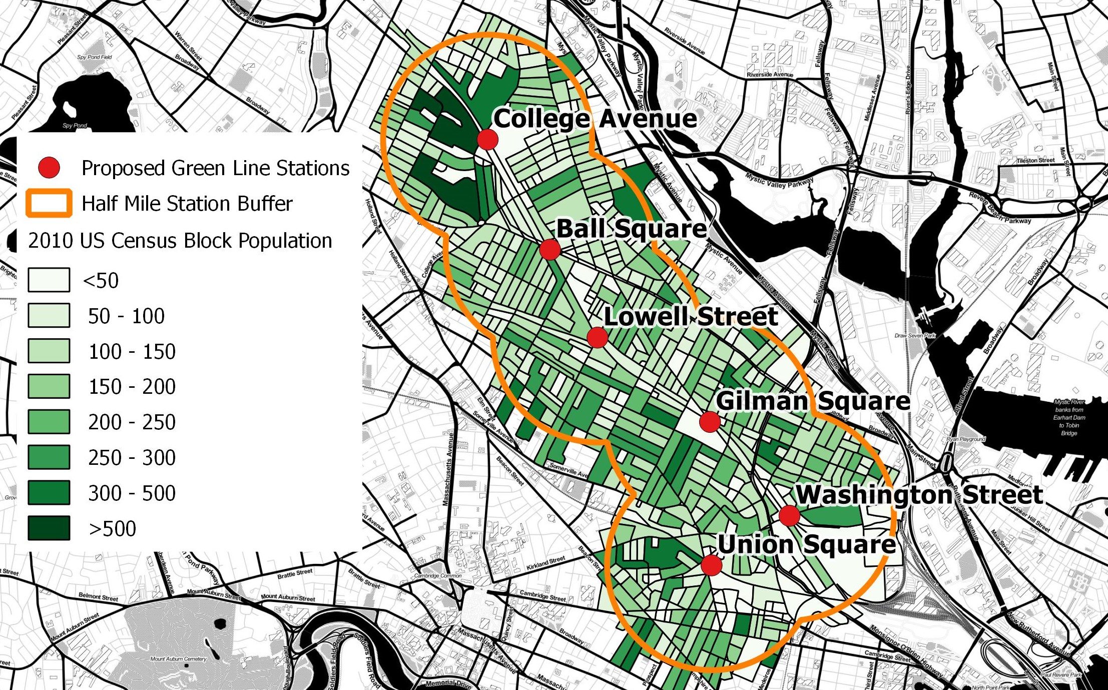
Being the armchair geographer I am, I wanted to take a quick glance at how the population in this relatively small area compared to other populations in Massachusetts using open data and open source software. According to the 2010 census, nearly 73,000 people (including me!) live within a half mile of a proposed station. The extension will run through several densely populated neighborhoods, originating from Lechmere in Cambridge and branching into two lines; one terminating at Tufts University at the College Avenue stop, and the other ending in Union Square.
Let’s put those tightly packed 72,000+ people into perspective. With maps!
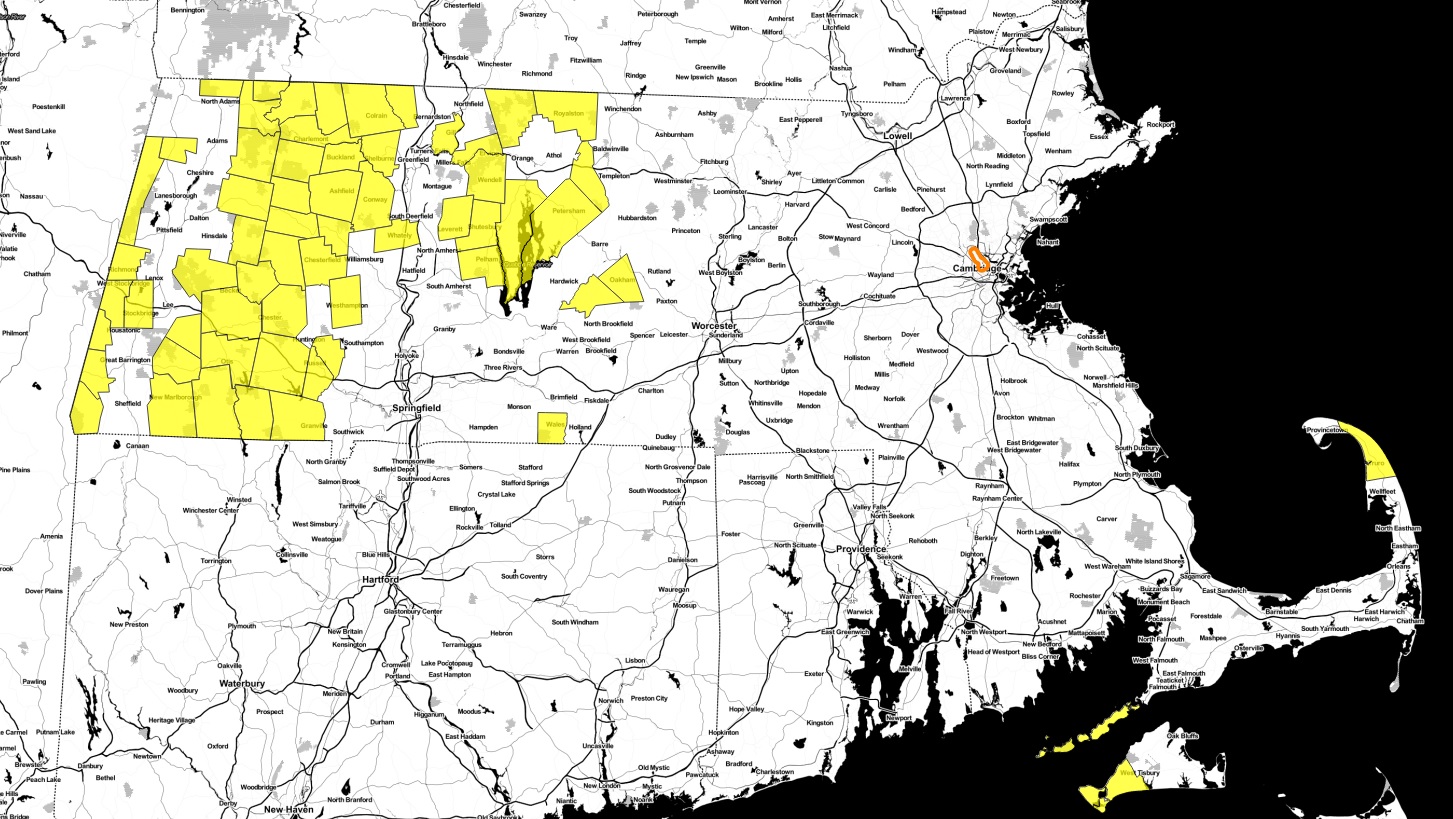
There are more people in this area than these 63 towns.
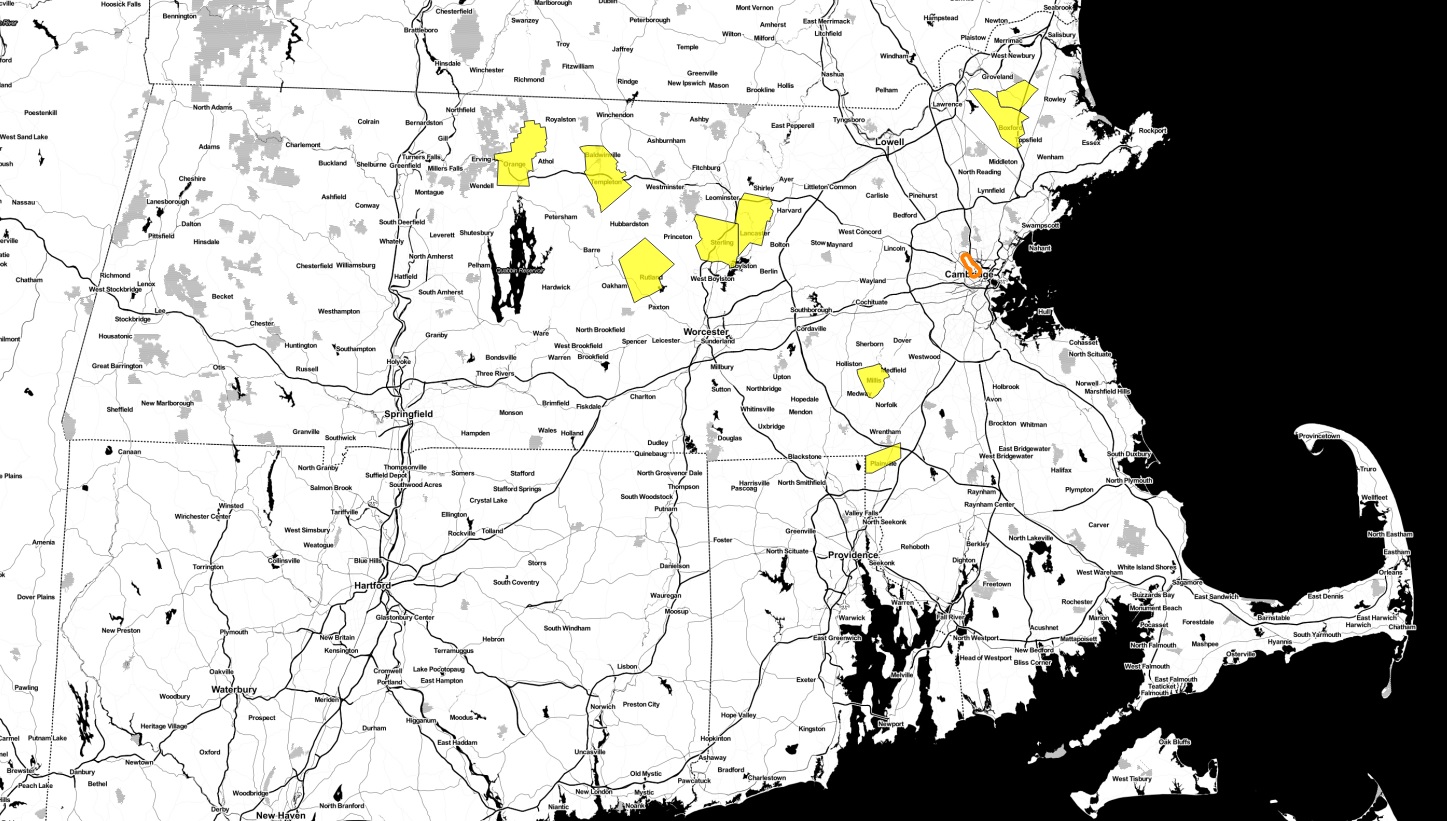
or these nine towns:
or these 22 towns:
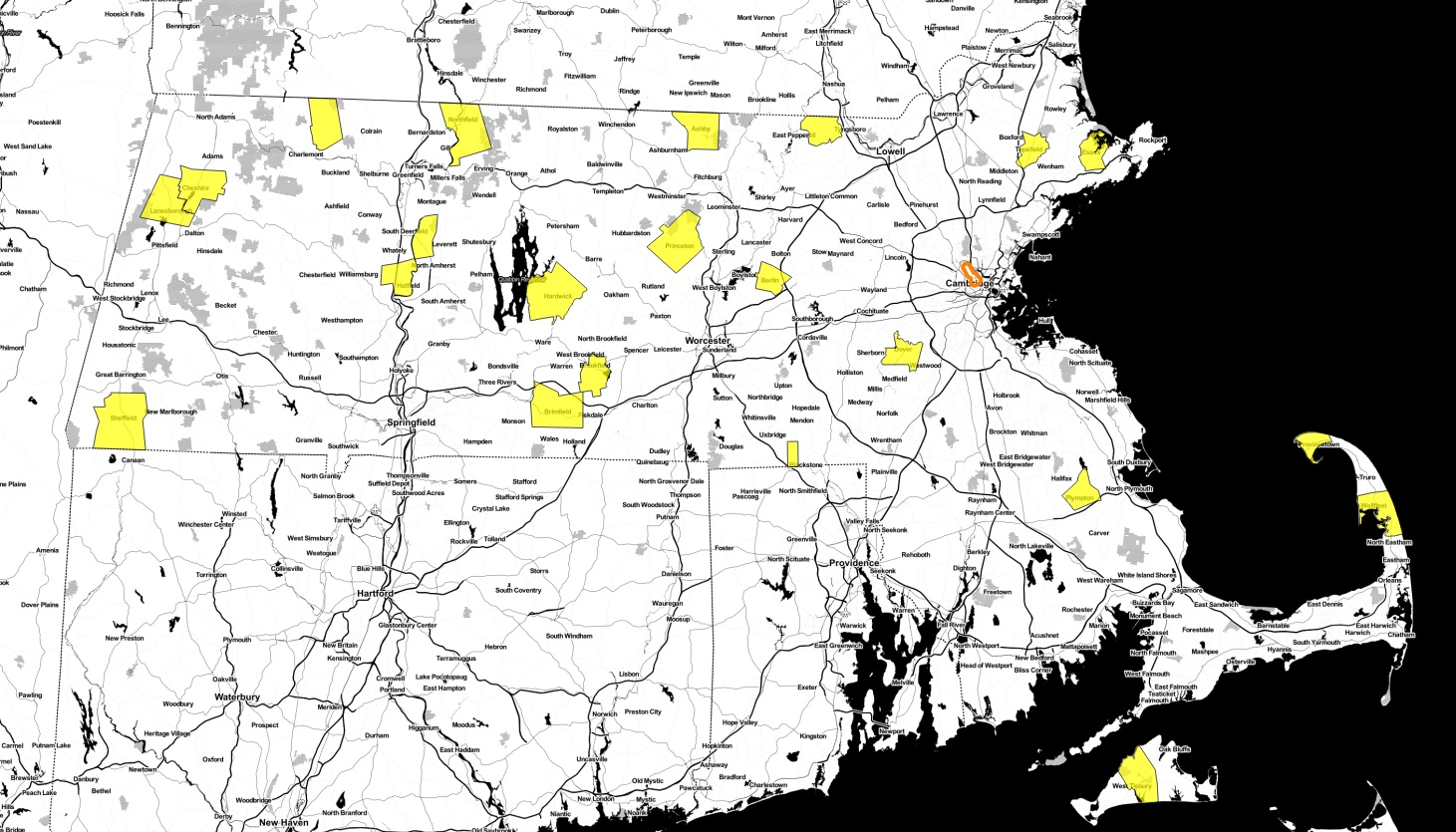
No matter how you cut it, the Green Line Extension impacts a lot of people and will be a transformative project for the region.
How I made the maps
I used QGIS Essen to build the buffers and plot the stations. The boundary data came from MassGIS, including the 2010 census block dataset, and town dataset. For the background map, I used Stamen’s toner basemap. To confirm the population estimate, I used information from the Green Line Extension Project Environmental Assessment and Section 4(f) Evaluation (table 6.15-1)
