Starting the 2017 Hubway Data Challenge

Time for a New Project 

A couple weeks ago, Hubway, Boston’s bike share service, announced their 2017 Data Challenge. For the challenge, Hubway is providing trip data for previous years, station data, as well access to real time data. Those who enter the challenge will build a wide variety of visualizations and analysis.  I think I might participate, so I downloaded the detailed month-by-month data for 2015 and 2016, as well as the station data and started to experiment.  This post will outline some of my early work before I actually figure out what I will (might) do for the challenge.

For those interested, submissions are due on April 10, 2017.

Making the Data Usable

Hubway provided the data in the only format that matters, csv files.  Since I don’t do much with text files (I am a database person), I wrote a few PostgreSQL scripts to wrangle the data from csv files into PostgreSQL.

The first script to I wrote was a loading script –  Hubway2017_loading.sql. The script is pretty simple. and does the following:

  • Build the tables – the schema is pretty straight forward
  • Load data into staging tables
  • Check for ‘bad values’ in each column – values that don’t meet the data type – they used a ‘\N’ for null. Make sure you check for that.
  • Load data into the final tables – I have each year in seperate tables.
  • Build geometry values for geographic analysis and visualization

The second set of scripts I wrote are analysis scripts.  To start with the data analysis, I wrote three simple analysis scripts:

Feel free to check out my github page for this project and grab whatever code you like.  I anticipate I will be adding more to this project over the next couple weeks.

Starting the Visualization

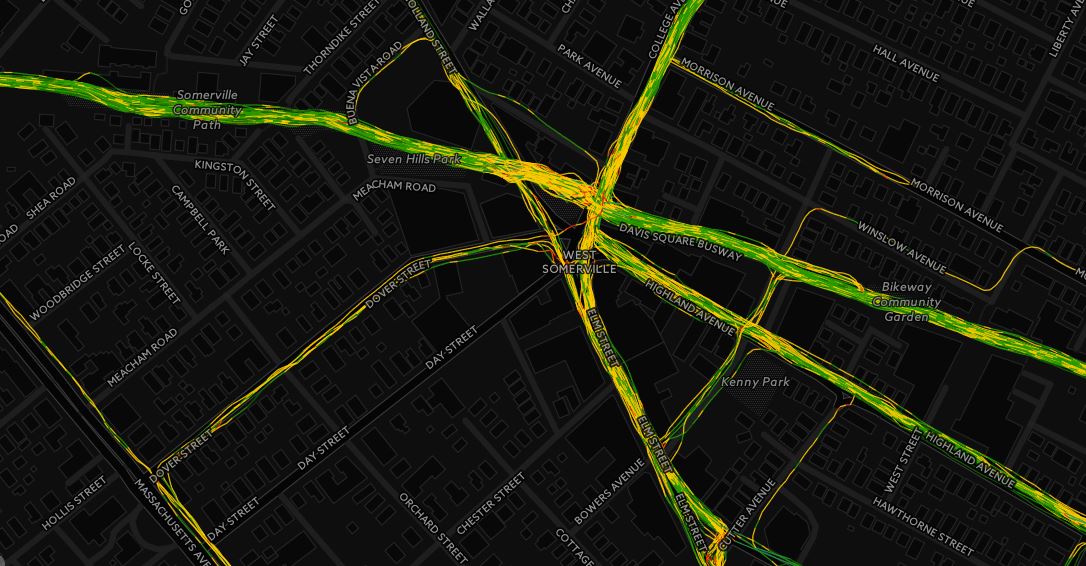
At the end of the Hubway2017_loading.sql script, I loaded the station data into its own table.  With that data, I created a GeoJSON file of the stations with the reported capacity value with QGIS.  I am using the GeoJSON format for a couple reasons.  It works more seamlessly with CARTO, and it can properly store a date value (something shapefiles don’t do well).

I have uploaded the dataset to my hubway github here.

For anyone who knows Boston/Somerville/Cambridge/Brookline, this pattern of stations will make sense.  The stations with lots of capacity stand out near South Station, MIT, and Mass General.  There are 187 stations in this dataset, however, I need to double check to make sure the stations that appear in the map below were actually in use during 2015/2016, as stations aren’t necessarily permanent.

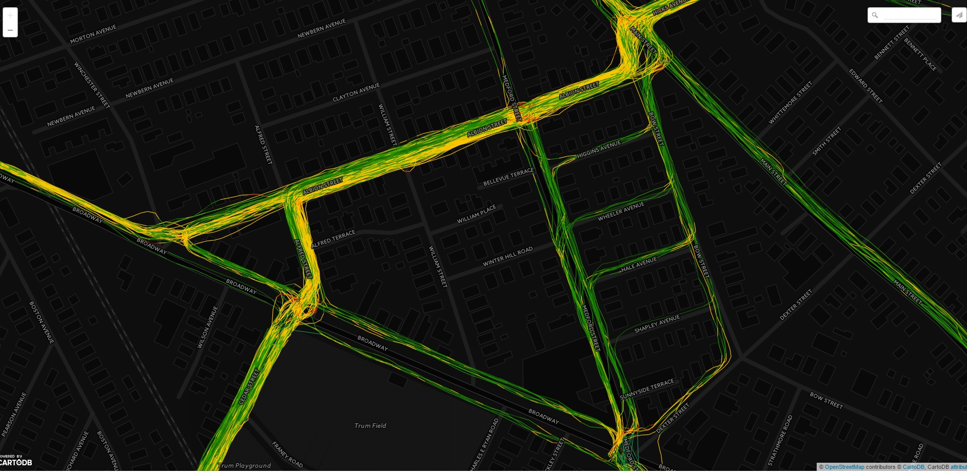
The next visualization I wanted to make was a time series map displaying the daily starts across the entire system for 2016.  The first step was to build a table with all the relevant data.  For those interested in the script, check out the OriginsByDay_Hubway2016.sql script. Once the script was run and the data created, I built a GeoJSON file in QGIS and uploaded it into CARTO. CARTO is a great online mapping service that is easy to use. If you are looking to make some maps for this challenge and don’t want to spend a lot of time leaning how to map or use mapping specific software, I encourage you to check out CARTO.

The following map steps through each day, visualizing the number of trip starts using CARTO’s Torque feature.  It is fun to watch as the trip starts ebb and flow with the seasons.  One can see stations come in and out of service across the city throughout the year, see major peaks and valleys in usage, and observe the strong relationship in trip starts between downtown Boston and the outlying stations.

Click here for the full size version (that works much better than the version limited by my wordpress CSS).

This simple visualization has given me a number of ideas on what to look into next including:

  • Quantify the relationships between usage and weather
  • The Giver and Taker stations – what is the net usage by station for each day
  • Is that station at MIT really that busy every single day?
  • Relationships between population density and usage
  • Usage in regards to major days in the city, i.e., Marathon Monday, MIT/Harvard/BU move in days, college graduation days, Boston Calling, bad T days (for those who ride the T, you know what I mean).

There are some real patterns in this dataset and it will be fun to look into them and share the results.

Busiest Days in 2016

The last script I put together was to find the busiest days in regards to trip starts.  The busiest day was August 9, 2016, with 6949 starts.  This was a Tuesday, which blows my mind. I am shocked that the busiest day wasn’t a weekend day.

The rest of the busiest days all had over 6k starts and all happened between the end of June and the end of September.  And again, all were on weekdays.  This is really weird to me, as I tend to think that Hubway is used by tourists, and presumably, on weekends (especially downtown). Seeing that the busiest days are weekdays, is actually a real positive for the system, as it can be seen as a viable alternative transit option.

As you can see, there is still a ton to do.  I need to get into this data some more and start to plan the story I want to tell.  Also, I need to do some more QA on the data, so I fully understand what I am dealing with. The biggest part of any data analysis project isn’t the generation of fancy interactive graphics (which no one uses)  or writing ground breaking algorithms; it is the dirty data work.  Without checking and double checking the inputs, the analysis could be wrong, and no one wants that.


Racing Myself – Using Torque in CARTO with runBENrun

As most runners do, I run a lot of the same routes over, and over again. During a run yesterday, I had the idea that I could pull all my runs on my three mile loop and race them against each other using CARTO‘s Torque feature.  It took a little bit of data prep to get my GPS data into a format to “race itself”, but I will spare the technical details for later.

Here are 25 separate runs I ran from 2016 on my Somerville 3 mile loop.  Each point is the lead GPS point of an individual run, with time steps synced, visualized by meters per second speed. To see the full size, click here (it is much better in full size).


Couple points about the race

  • Winner – 10/11/2016 – 3.13 miles, 19:10 time,6:07 pace
  • Loser – 12/12/2016 – 3.13 miles, 24:26, 7:48 pace
  • There are a few deviations on the route, especially at the end.  This is because of number of factors, either because I made a different turn or had to run a little longer to get the required distance due to GPS errors earlier in the run.
  • I am able to race myself because the data I generate with runBENrun project uses elapsed time, so I am able to compare run against run.
  • I used a Nike+ watch, and scraped the data into my own environment using Smashruntapiriik, and my own code.
  • The very last point to leave the map is a run where I didn’t turn off my watch at the end and walked into my house!

Here is How I Created the Race

Warning – Technical Details Ahead! Ahh Yeah!

In 2016, I ran my Somerville loop 25 times.  It’s a pretty flat and fast course, that has a good long straightaway down the bike path, but it does have a couple tight turns and pauses waiting for traffic to cross Broadway.

I run this loop in many different phases of training periods.  Sometimes I try to run fast on this loop, but other times I am using this course for a recovery run. As I was preparing the data I thought my pace and times would be all over the place.

First step was to run a query against all of my 2016 runs to find all three mile runs, that where not classified as interval runs (github here). The script returns any run that rounds to three miles. So I had to do some post processing.

The query returned 42 three mile runs in 2016.  The next step was to pull all of the shapefiles I generated for these datasets a while back (code here!) and check the routes using QGIS. I removed a number of races I ran, and a few three mile runs that weren’t along this route. Once the set was cleaned, I ended up with following 25 runs.

You will notice that the routes don’t all follow the same path.  In fact, I often end at different places on different streets.  This is for a couple reasons: I may have to run a little extra at an end of a run due to pauses in my GPS, or I took a turn a little early toward the end of the run down and I had to make up the distance at the end. Overall, the 25 runs represent a pretty consistent route.

Querying my runBENrun database, I can get my stats for the 25 runs, and checkout how consistent, or inconsistent, I am on this route (github here). The spread of times isn’t too bad, so it should show a decent race.

From here, I wrote a script to create a postgreSQL table with all the relevant runs from the master GPS point table for 2016 (github here).  I made sure to cast the finaltimecounter column as time so that I could use it in CARTO later on.

The output table contains over 29k points, as seen below.  This dataset is what I need to use in CARTO for the animation using Torque.  Using QGIS, I exported the dataset  as a GEOJSON.  Why GEOJSON? Because I had a time field and shapefiles don’t play nice with time data.

I imported the GEOJSON dataset into CARTO and then used the following settings in the Torque Cat wizard.  I found the following settings gave the best view of the “race.” CARTO is super easy to use, and the Torque Cat tool provided a lot of options to make the map look really sharp.

In the end, I got a nice map showing me race myself.  I have a few ideas on how to improve the map and data, but that will be for another time.

Thanks for reading.

runBENrun – Part 1- It’s All About the Data

In 2016 I set a big goal for myself; get better at what I do. That includes geo-stuff, fitness stuff, personal stuff, and tech stuff.  It’s spring time, so now is a good time to start another project.

I run. I run a lot. I also like data, maps, and analysis.  I’ve been running for many years, but only since May 2014 did I start to use a GPS watch and track my runs through an app.  I run with a TomTom Nike+ GPS sports watch.  It has been a good sports watch. It is not as feature-rich as some of the new sport watches on the market, but it has a bunch of features not available in lower cost models. Having this watch is great, but that’s not the point of this project.  This isn’t a watch review. This is a geo-nerd running man project.

I am calling this project runBENrun.  The goal of the project is to get my data out of the Nike+ system and into my own hands, where I can analyze and visualize how I want to.

The first phase of this project will cover the data acquisition, cleaning, and early visualization testing – all with a geo/maps/GIS focus.  Over the course of the next few months, there will be other posts about additional analysis,code, and visualization I take on with this very awesome geo-data.

All of the scripts I am putting together will be on my now back-from-the-dead github account. Feel free to check them out!

The Problem

One of the benefits of buying Nike’s watch, is that you get to use their website (update – Nike updated their site in early June 2016, so the screengrabs below are out of date, but the general idea is the same), where one can upload their workouts and see a number of pretty basic running stats like average speed, total time, miles run, and a choropleth map of the run. It’s not a heat map. Don’t call it a heat map. One can also view their previous runs and there are a number of milestones and badges that users can earn for any number of achievements.

Screen grab of my 4/10/16 run
Screen grab of my 4/10/16 run – Overall, the Nike+ site is a pretty good free app

The app has been good, again, for a free service. I don’t complain about free.  But, as I started getting more and more serious about my workouts, training for races, and improving speeds, the app only helped so much.  I knew what I wanted to analyze the data more in depth.

The Goal

Beyond opening my data and getting insight from hundreds of runs and thousands of miles, I want to expand and improve on a number of my geo-skils.  I want to use a few python libraries I hadn’t explored before, get into more Postgres scripting and geo-analysis, and then really improve my web vis skills, since I haven’t done any web stuff in a long, long time.

Let’s get started.

Data, Data, Data

The first step in this project is to collect all my running data.  When I started working on this project it was mid-February and I had over 300 runs stored in my Nike+ account.  Unfortunately, Nike+ doesn’t have a quick export feature. I can’t just go and click a button in my account and say “export all runs”, which is a bummer.

Nike+ does has an API to collect data from the site, but I didn’t use it in this phase of the project.  I used the since retired, Nike+ Data Exporter, a free tool provided for by Rhys Anthony McCaig. It was easy to use and provided easy to parse zipped GPX files. Overall, all of my run data was about a 100mb. I will eventually build my own tool to pull my run data from my Nike+ account.

Python is the Best

Once all the data was downloaded I needed to start processing the data. For this project, I decided to use the only language that matters: Python.  I built a few scripts to process the data and start the analysis. The links here go to the gitbhub links for each script.

Parse GPX to Text File

  • Rhys McCaig’s script returned GPX files and I had hundreds of them to parse through.  This simple script uses the gpxpy library, with code assistance from urschrei’s script, the script converts the data from the GPX format to a flat text file for all files in directory.

Rename the Files

  • Quick script to loop through all the datasets and give them names that made sense to me. It’s pretty simple.

Update the GPX Data

  • The Update GPX Data script with where the magic happens, as most of the geo-processing happen here.  The following points out some of the scripts highlights. Check out the code in github for all the details.
    • Uses a three specialized spatial python libraries, including fiona, pyproj, and shapely.
    • The script uses every other point to generate the lines and for speed and distance calculation. Using every other point saved on processing time and output file size, without distorting accuracy too much.
    • Manipulating dates and times
    • Calculating stats – average pace, meters per second, distance (meters, feet, miles). Meters per second is used in the visualization later on.
    • Shapely is used to process the spatial data.
    • Fiona is used to read and write the shapefiles files. I built a shapefile for each run.
    • Pyproj is used to change the coordinate system to make proper measurements between points.
    • If you are a geo-person I highly recommend checking out Shapely, Fiona and Pyproj.

The Results

I’ve run my code on my backlog of data.  Here are a few things I have learned so far.

  • Number of Data Points – The Nike+ watch stores a point every ~0.96 seconds, so my average run (6 miles) logged about 5,000 points. When I process the data, I only kept every other point in the final shapefiles, but I did keep all the data points in the raw output. If I end up storing the data in a single table in PostgreSQL later on, I will need to think about the volume of data I will be generating.
  • Number Links – For a ten mile run in January, my output shapefile had over 2,300 links, which is very manageable.
  • Run Time – Most of the time I am in the “let’s make it work” and not the “let’s optimize this code”.  Right now this code is definitely “let’s make it work”, and I am sure the python run times, which aren’t bad (a couple minutes max) can be improved.
  • Data Accuracy – With the visualization tests, so far, I am pretty happy with using every other point.  With a personal GPS device, I expect some registration error, so if my run is exactly on a given sidewalk or road.  For this project, “close enough” works great.

Early Visualization Tests

Once all the data was processed and the shapefiles were generated (I’ll get some geojson generation code to the project next), I pulled them all into QGIS to see what I had.   At first I just wanted to look at positional accuracy. Since I am only using every other point, I know I am going to loose some detail. When zoomed out most maps look really, really good.

All Runs through Davis Square
All runs through Davis Square

When I zoom in, some of the accuracy issues appear.  Now, this isn’t a big deal.  I am not using my GPS watch as a survey tool. Overall,  I am very happy with the tracks.

Accuracy with Ever Other Point from GPS output
Accuracy with every other point from GPS output – 2015 runs

The next step was to start to visualize and symbolize the tracks. Could I replicate the patterns I saw on the Nike+ website map using QGIS?

Yes. It was pretty easy. Because QGIS is awesome.

Using the meters per second data I calculated in the code, I symbolized it with a couple individual runs and then applied the defined breaks to all the datasets for a give year (using the mutliMQL plugin in QGIS) to get the following results.  When I compare the color patterns to individual runs on my Nike+ account I get really good agreement.

Using QGIS to visualize all 2015 data

Using CartoDB

I wanted to get some of this data into an online mapping tool. As you all know, there are a growing number of options for getting spatial data online.  I went with CartoDB.  I chose CartoDB because Andrew Hill bought pizza for an Avid Geo meet-up once and it was good pizza.  Thanks Andrew!

There is a lot to like about CartoDB.  The tools are easy to use and provided plenty of flexibility for this project.  I am a fan of the available tools and I am looking forward to getting more into the service and seeing what else I can do during phase 2 of runBENrun.


2014 – I ran along Mass Ave into Boston a lot


2015 – Pretty much only ran on the Minuteman Parkway bike path and a bunch of Somerville/Cambridge/Medford loops

All the data is in I generated in the code is in these maps.  I didn’t trim the datasets down to get them to work in the CartoDB tools. That was nice.

I really like this view of a bunch of my 2015 runs through Magoun and Ball Squares in Somerville/Medford.

I guess I don't like running down Shapely Ave!
I guess I don’t like running down Shapley Ave!

What’s Next

The data processing isn’t over yet and there is a lot of things to do before I can actually call this project finished.

  • With Rhys Anthony McCaig’s Nike+ exporter retired, I need to write some code to get my runs after January 2016.
  • I need to start the real analysis.  Get more into calculating stats that mean something to me, and will help me become a better runner (and geographer).
  • Start expanding data visualization.
  • I would also like to simplify the code so that I can run a single script.
  • Run on every street in Somerville and South Medford!

Liquid Geography!

I’m not a big wine guy, but this is probably a product I could support.

Liquid Geography

Is Liquid Geography like liquid courage?  If I drink a whole bunch of this stuff am I going to get an irresistible urge to travel the world and map it all at once?  I hope so!

Also, check out the Geography of Wine.  It’s a real thing.


Finally on GitHub

I’ve had a GitHub account for a few months but I never posted anything to it, mostly because I am a busy guy, and I ‘m not very confident in my code (I am not a developer, but I know how to cause some trouble).

Well, I finally got over my fears and I posted three repos on my GitHub page for three simple Leaflet apps: a random map generator, a icon toggle app, and an extent tracker.  I don’t know if these particular apps have any use to anyone, but I figure it’s better putting them up on GitHub than burying them on my website.  Speaking of burying them on my website, I’ve updated the code examples page to include the three working copies of the aforementioned pages:

There are plenty of areas of improvement in my repos (I didn’t comment anything and my JavaScripting is probably not in the best form), so I’ll hopefully be making some new commits over the next couple weeks.  Now I just need to get the hang of checking code in to GitHub on a regular basis.


Updates to BenjaminSpaulding.com

A few years ago my old boss at MAGIC gave me benjaminspaulding.com and some hosting space as a going away gift.  I Didn’t do much with it early on (I built this site instead using the hosting), but eventually I set up a static page with some basic info.

Well, after a few months of poking around I finally got the new benjaminspaulding.com up and running.  Being a geographer, I have some mapping components on the site (powered by Leaflet) along with links to my twitter, linkedin, and GISDoctor sites.  The site is a hobby of mine and by no means do I profess to be a professional web developer.  I did test the page with the latest versions of IE, Chrome and Firefox and everything I wanted to do worked.  However, if something is broken for you let me know.

Thanks!

Geography is important, no matter what the commenter says

I usually don’t respond to comments on my blog post, but I feel the need to respond to a couple items from a recent comment posted on everyone’s favorite article on this blog. Before I start my response let me say that I agree with some parts of the comment, which I will discuss later.  However, I really disagree with other passages and I’ll talk about those first.

But first, the comment…

From Chris, posted on 6/18/2013

“ESRI days are numbered. The place is a sinking ship. They have totally lost control of both the gis data and software monopoly they once had back in the 80s and 90s.

Open Street Maps and QGIS are hammering ESRI now. You can’t give away ArcGIS since EVERYTHING is free with other gis packages and data.
There are so many map apps and programs that BEAT ESRI at their own game. Newer and easier ones are popping up faster everyday now.

A person off the street can make a cool mash-up using QGIS and geoJSON.
If you are really map challenged there is:
http://www.theatlantic.com/technology/archive/2013/06/stamen-design-reveals-an-instagram-for-maps/276713/
http://mapstack.stamen.com/

And there is NO need for a degree in Geography to make maps anymore! This field of study is basically dead and has been bypassed in the last few years. Colleges need to stop teaching it since the public uses digital maps everyday now and are getting daily geography lessons for free!

ESRI better be shopping themselves around before Google adds massive gis tools to Google Earth and finishes them off. This multibillion dollar company will be worth nothing in a few years at the rate of free map tool and data advancement.
Sounds like not too many smart people are left at ESRI since most have left to go to start ups. ArcMap 10 basically validates this.

And the way Open Source is going, their won’t be to many companies left that will be able to demand thousands for their software. Especially bad software. ESRIs biggest customer, which is the U.S. Government, is slowly waking up to this fact. The Gov needs to save our tax dollars and go more to the free open source software ASAP.”

Now, my response:

The “open vs. commercial GIS” mentality is getting old.  I am getting sick of it, and you should be too.

We should all be vested in the development of GIS as a science, as a tool set, and as a way of thinking, whether it is commercial or free, open or closed.  GIS is aided by the growth of both free and open source and commercial software. It is pretty well known that the commercial sector now has real competition and they need to respond. This is a good thing.  Saying that open source GIS is going to kill commercial GIS software is like saying that Linux has killed Windows or PostgreSQL killed Oracle. These commercial GIS shops are embedded deep in many organizations and they aren’t going to be dropping them any time soon. That is a choice that they made, and when the business case dictates a change they will make it.

Now, will organizations who are new to GIS or at a point of transition choose to go with open source platforms that are light-weight, reliable, and free and easy to use when they design their next implementation? Probably. I would, especially if cost was a factor.

The more scientists, engineers, planners, civic leaders, decision makers, concerned citizens, business leaders and educators who use GIS the better it is for GIS community as whole. The GIS community should be working together to move technology forward – not digging trenches and setting in for battle.  It is a horribly counter productive strategy.  Any users of GIS, online mapping, or spatial analysis would logically want the field to grow and evolve. Competition helps drive that growth and evolution and I am all for it.

And, why do people keep saying/thinking that Google should buy Esri, or that Google Earth is going to overtake ArcMap? I’ve never understood this argument. Never. Why would Google, who has really failed at commercializing their current geo-stack, go after such a small market when compared to their other endeavors?  If you were a smart company that makes a lot of money what market would you focus on as revenue driver? Millions and millions of mobile users, or a few thousand specialized (and picky) GIS software users?  How many of you are paying for Google Maps or have bought Google Earth Pro? Not many? That’s what I thought.  Let’s just drop this train of thought.

Now for the second statement in the comment that drives me absolutely crazy:

And there is NO need for a degree in Geography to make maps anymore! This field of study is basically dead and has been bypassed in the last few years. Colleges need to stop teaching it since the public uses digital maps everyday now and are getting daily geography lessons for free!

This statement is so horribly misguided I don’t even know how to respond.

Let’s try. There is a calculator on every computer and smartphone made, and we use them all the time.  Does this mean we need to eliminate math as a discipline at the university level?  Anyone can download a content management system and build a website.  Time to get rid of computer science departments!  Turbo Tax! Get rid of accounting majors! WebMD. Who needs pre-med?

See where I am going with this? Just because a tool exists does not mean that a particular discipline should be eradicated.  You still need some background to understand what you are looking at.

I have three degrees in geography.  A bachelors, masters, and Ph.D. .  During those years of schooling and research I did far more than make maps and use online mapping tools.  Geographers study far more than just cartography and learn about place names, check out my dissertation for proof.

Geographers have been crucial in the development of the theory, logic, and science behind the G in GIS.  The field of geography has also provided countless contributions to spatial analysis, policy and planning, environmental science, economics, anthropology, sociology, biology, civil engineering, and many more and will continue to so.  In fact, we need more geography being taught at all education levels.

Geography matters. It always has and it always will.

To say that geography doesn’t matter displays a lack of understanding that is all to common in the GIS community.  Sometimes I am floored with the lack of understanding of the basic principles and fundamentals of geography among those who use GIS, online mapping tools, or any other type of spatial decision making system.  Without a basic foundation in geography how do you expect to make the correct decisions using a GEOGRAPHIC information system?  I’m not saying that everyone who uses GIS needs a Ph.D. in geography, but taking a couple geography courses during your undergraduate years isn’t going to hurt.

Now, what do I agree with from the comment?

  • Governments need to invest more resources in free and open source software of any type.  No excuses.
  • You don’t need a degree in geography to make a map, but it sure does help
  • OpenStreetMap is great, but let’s not forget where a majority of the US data came from in the early uploads (TIGER).
  • I love QGIS.

That’s enough for this post.  I didn’t do a god job summarizing my thoughts at the end, but it is getting late and I want to go to bed. More rambling and ranting will come in later posts

As always, thanks for reading.

Google Maps API v2 Deprecation and GISDoctor.com Mash-Ups

The old news on the street is that the Google Maps API v2 will be deprecated in just a few weeks in May 19th 2013.  I have a few old Google mash-ups that I never upgraded to v3 of the API that are floating around this site and I will retire those pages when the time comes.

However, one of my v2 mash-ups is a nifty transparency slider that I modified to work with WMS data.  I will be updating that site to v3 of the API before the last days of v2.  I’ve been saying that I was going to upgrade this app to v3 for a while now and I should probably do that soon.  Nothing like the deprecation of a API to get you motivated to write some code!

For more info on the v2 deprecation and a whole bunch of Google Maps news visit the Google Geo Developers Blog.


Happy Presidents’ Day – Leaflet Edition!

I’ve been seeing a lot of Leaflet lately, whether it’s in my twitter stream, on Boston.com, or hearing others in the geo-community talk about enthusiastically.  So, on a snowy Sunday in Somerville, I decided to give a Leaflet a try.  To honor the 43 presidents (remember, Grover Cleveland was both the 22nd and 24th president) of the United States of America I put together a simple leaflet app of each president’s birthplace (according to Wikipedia).

Leaflet in Action
Leaflet in Action

I’ve built plenty of web mapping apps with Google and Esri APIs, but by no means am I an expert.  If you have ever built a web-map using either of those APIs you will be able to build and launch a web map with Leaflet, no problem.  More than likely, you will be able to create a web ready map more quickly with Leaflet as well (as was my experience).

The app I built adds a few markers with custom icons and modified popups.  I read in and customized a state boundary geojson file from a Leaflet tutorial to give the user some context of “where” at larger scales.  The background tiles are from CloudMade and are nice and fast.

I don’t think I configured the autopan for the popups correctly as it doesn’t work as I think it should.  More than likely I just don’t have the right settings configured.  If you see something in my jumbled (and undocumented) code leave a comment and I’ll make the necessary updates.  I would eventually like to add a drop shadow to the presidential seal icons and perhaps read the data directly from a PostGIS database, as opposed to creating static markers.

The Leaflet documentation was easy to understand and the samples provided enough guidance to get a map online that did what I wanted it to do.  I wish there were a few more samples available through the Leaflet tutorials section, but those will come as the user community grows.

Overall, my first experience with Leaflet was generally pleasant.  I know JavaScripting  but I am not an expert and I was able to get a map online pretty quickly.  I spent more time collecting and formatting the data than I did getting the map online.  That is a good thing.  I recommend to those who have programmed with the Google or Esri API to check Leaflet out.  Added bonus – free and open source.

The page I created is for demo purposes only.  I only tested this in Chrome and Firefox (sorry IE users).  If there is incorrect information in the map please let me know and I will update it accordingly.

Finally, here is the direct link to the app:

http://www.gisdoctor.com/presidents.html

Happy presidential mapping!


The Worst “Heat Map” I Have Ever Seen

I am no fan of geographic heatmaps, especially those that are really just density maps or poorly interpolated surfaces.  To me the term “heatmap” is just an overused marketing term.  So, when I came across this “heatmap” today I had to laugh:

Rental Heatmap” from Boston.Curbed.com

And here is a screen grab (in case they edit their page!).

There is no heatmap here, at all (unless I am totally using this page incorrectly, which isn’t out of the realm of possibility).  No doubt, it’s a slick web-map application that really aids the story, but let’s call a spade a spade.

Side note:  Is the term heat map so popular because choropleth doesn’t sound cool?